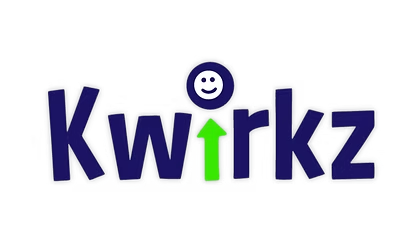
How to use the Kwirkz name and logo.
For sponsors, partners, press and volunteers making something with our name on it. The rules are short, and the first one matters more than all the others put together.
It is spelled Kwirkz.
Capital K, no C anywhere, and it ends in a z. Not Quirks, not Kwirks, not KWIRKZ in full capitals in running text. The name is a play on the ordinary word "quirks", and the whole joke collapses if the spelling drifts. It is the single most common thing people get wrong.
Kwirkz
Correct, always, including at the start of a sentence and inside a headline.
Quirks, Kwirks, Kwirkz®
Wrong. The first two are misspellings. The third claims a registration we have not made.
"We all have quirks"
Lowercase and spelled the ordinary way, because here it is the real word rather than our name. That contrast is the point.
Two colours, and their accessible variants.
Navy and green. The extra greens are not decoration, they exist so that green text on a light background and white text on a green fill both clear the contrast minimum. Use the one that fits the job rather than the brightest one.
| Name | Value | Use it for |
|---|---|---|
| Kwirkz navy | #1C1362 | The primary brand colour. Headlines, primary buttons, the dark surface behind white logos. |
| Kwirkz green | #43B649 | Accents, dots, rules and highlights. Not for white text on top, it does not carry enough contrast. |
| Grass ink | #308234 | Green fills that carry white text, such as the Donate button. |
| Grass text | #297F2F | Green words on a light background. |
Three typefaces, each with one job.
The script face is the one people misuse. It is for large display headlines and the wordmark only. It is not a body face, and setting paragraphs in it is the single biggest readability risk in this brand, on a site read by the people who can least afford it.
Curse Casual
Display only. Big headlines and the wordmark. Never body copy, never small sizes, never a whole paragraph.
Nunito
Every small title, label, button and tag. Weights 600 to 900.
DM Sans
All running copy. Everything you actually sit and read.
What not to do to it.
Ask us for the files rather than pulling one off the page or tracing it. We will send the right format for what you are making, including a white version for dark backgrounds.
Do not stretch it
Scale it proportionally. A squashed wordmark is the most common way this logo gets damaged, usually by being forced into a box that is the wrong shape.
Do not recolour it
Navy on light, white on dark. No gradients, no shadows, no outlines, no third colour, and never navy on navy.
Do not crowd it
Leave clear space around it, roughly the height of the K on every side. Do not set type inside that space or run it up against the edge of a card.
Do not imply endorsement
Sponsors and partners may say they support Kwirkz. Using our logo in a way that suggests we endorse a product, a candidate or a business is a different thing and needs our written agreement.
Need the logo files? Email thekwirkzfoundation@gmail.com and say what you are making. Press, sponsors, schools and volunteers all get them, usually the same day.
Making something with our name on it?
Send it over before it goes to print. We would far rather spend two minutes looking at a proof than see the name spelled Quirks on a banner at our own event.
Send us a proof →